How to Design Presentation Folders
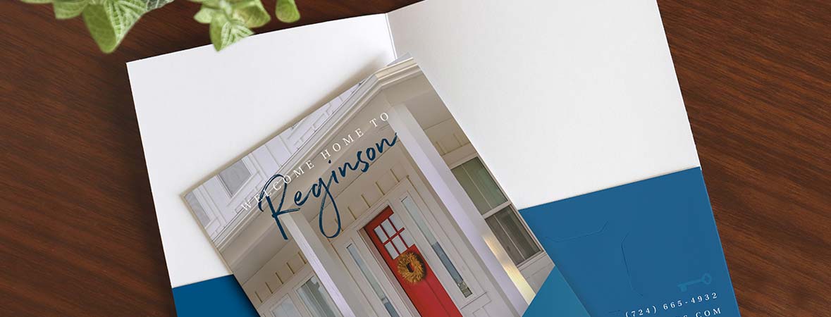
Tips on designing printed pocket folders and foil stamped folders
Designing a presentation folder for your business isn't difficult, but it does take some time and effort. Not sure where to get started? We've put together an easy-to-follow design checklist to help you through the process, and our presentation folder experts are here to help you out. Whether this is your first big project or you're a seasoned designer looking to brush up on your skills, these pocket folder design tips are sure to help you on your way.
Have a vision.
Gather as much information as possible from your client or those who will be handing out these folders. Refer to their brand stylebook, ask them what colors they prefer, how they want their company image perceived, and who will be receiving the folders.

Know your audience & your competition.
Who are you selling your goods or services to? Start by defining your market by simple classifications like occupation. Be careful not to base your design off of stereotypes. Visit competitor's websites. Draw inspiration from their designs, but more importantly, figure out how your design can better connect with your customers.
Choose a finish: Print, Foil Stamp, or Emboss
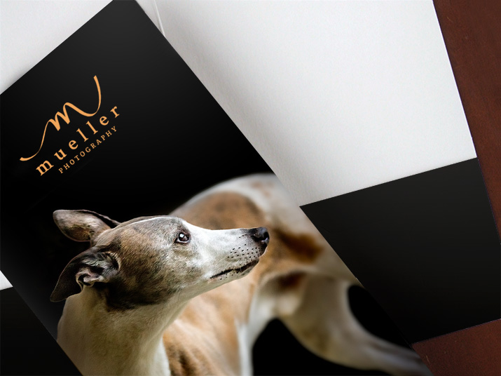
Printed Pocket Folders
Print your logo in one color or do a full-color design. With printed pocket folders, you can print on the front cover, back cover, and pockets.
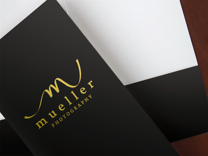
Foil Stamped Folders
Imprinting gives your company folders a classic look—at an affordable price. Choose from 26 foil colors to match your branding.

Embossed Pocket Folders
Sometimes subtlety is the best way to go. We specialize in blind embossing, which is a time-tested customer favorite. Learn all about embossed folders.
Folder design tips from our team
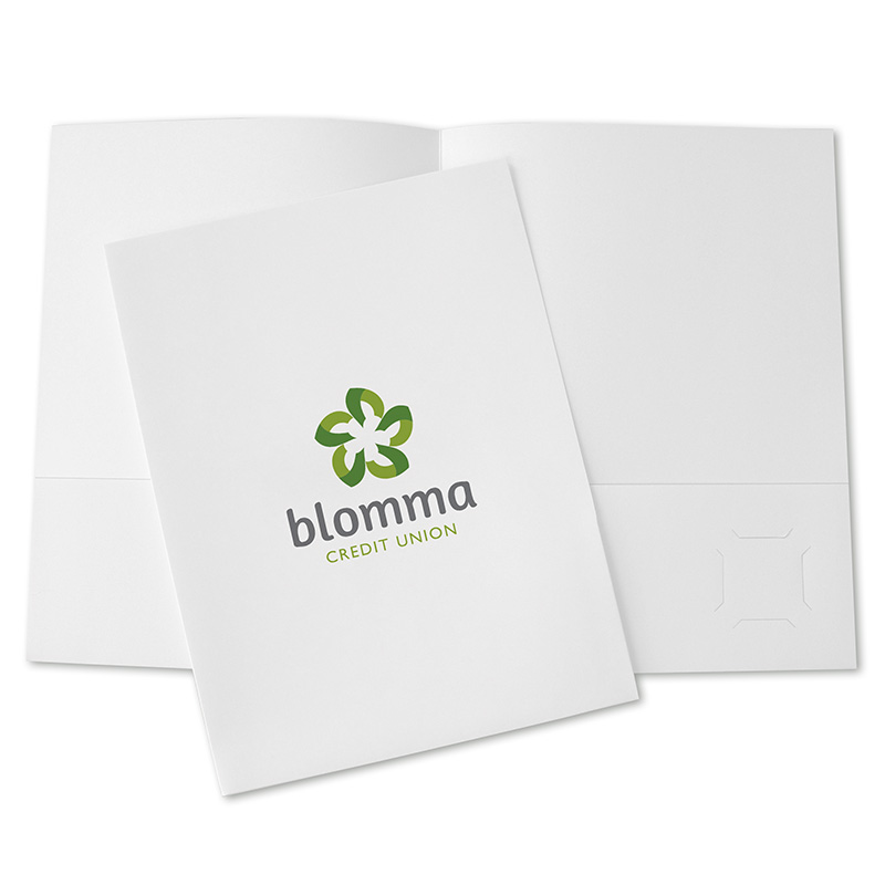
Use your logo and nothing else
Sometimes all you need is your company logo. It's often be enough to remind consumers of your company, and has your branding built right in.
Logo Tip: If you have a colorful logo, print it on a white paper stock so it stays nice and vibrant.
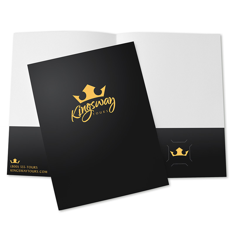
Mind your color palette
You can accomplish a lot with just one or two colors. If you're stuck on how to use colors in your design, check out this handy pocket folder color guide.
Business Card Tip: Place your logo where the business card goes so that when your card is removed, your logo is still visible.
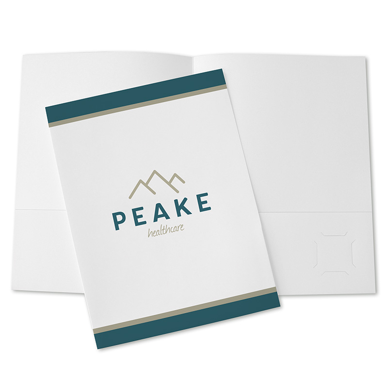
Build your design with shapes
If you want a little more than just your logo, consider adding a few shapes, like stripes to the top and bottom of the folder, as shown here.
White Space Tip: White space is a good thing. If you have a busy logo, add simple design elements so your logo remains the focal point.
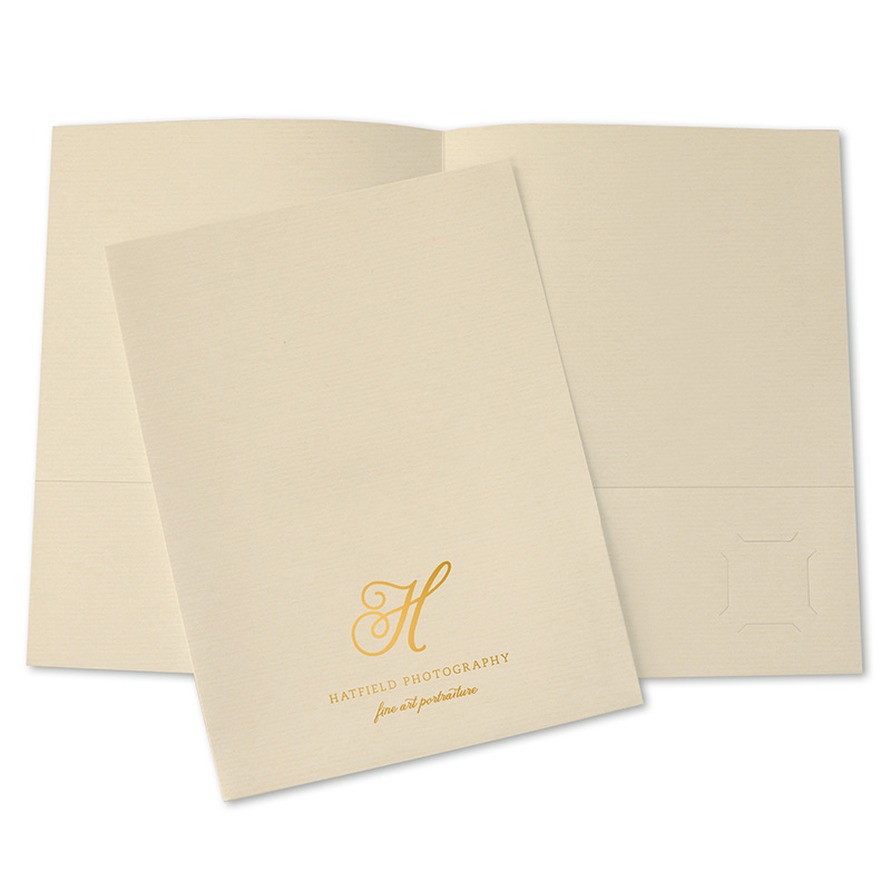
Enhance your logo with paper
Put your logo on marble, laid, linen, metallic, recycled, weave, or corduroy paper stocks. These papers are great for foil or embossed logos.
Imprint Location Tip: Download a template to see where your logo will look best. The most popular locations are centered or top third.
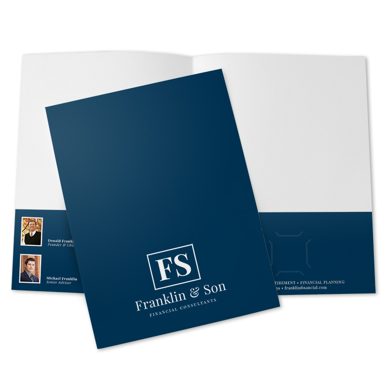
Leave plenty of white space
It's easy to go overboard when designing folders. We find it's best to keep things simple, so don't add distracting elements around your logo.
White Space Tip: If you want lots of white space on the front cover, consider moving other important information to the back cover and pockets.
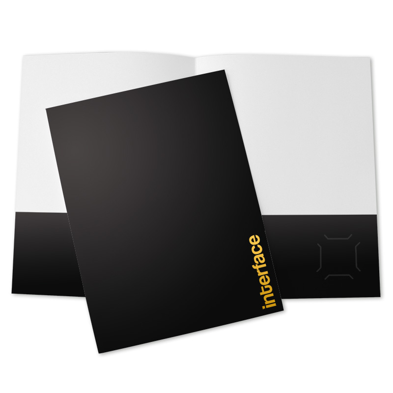
Consider unconventional logo placement
This depends largely on the size and shape of your logo, but consider placing it somewhere unexpected—as long as it's still easily visible.
Folder Edge Tip: Be sure to leave ⅛" between printed artwork and the folder edge (⅝" for foil stamping) so nothing important is cut off.
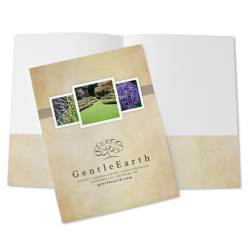
How to use photos in pocket folder design
Show photos of completed projects or include a professional portrait. Be sure to limit your photos to just three or four so they don't lose their impact.
Photo Tip: Professional-quality photographs will help sell your product or service, so consider hiring a photographer to take your pictures.
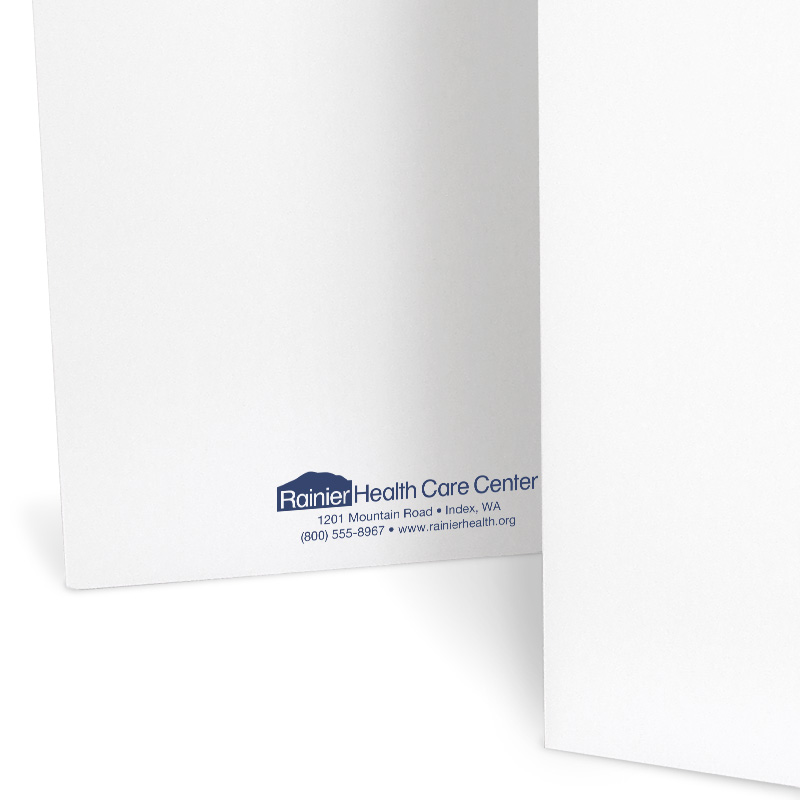
Include your contact information
Add your contact information in case your business card is lost. You can put it on a pocket, on the bottom of the back cover, or just a line below your logo.
Contact Information Tip: Include your phone number and website so clients have options to contact you.
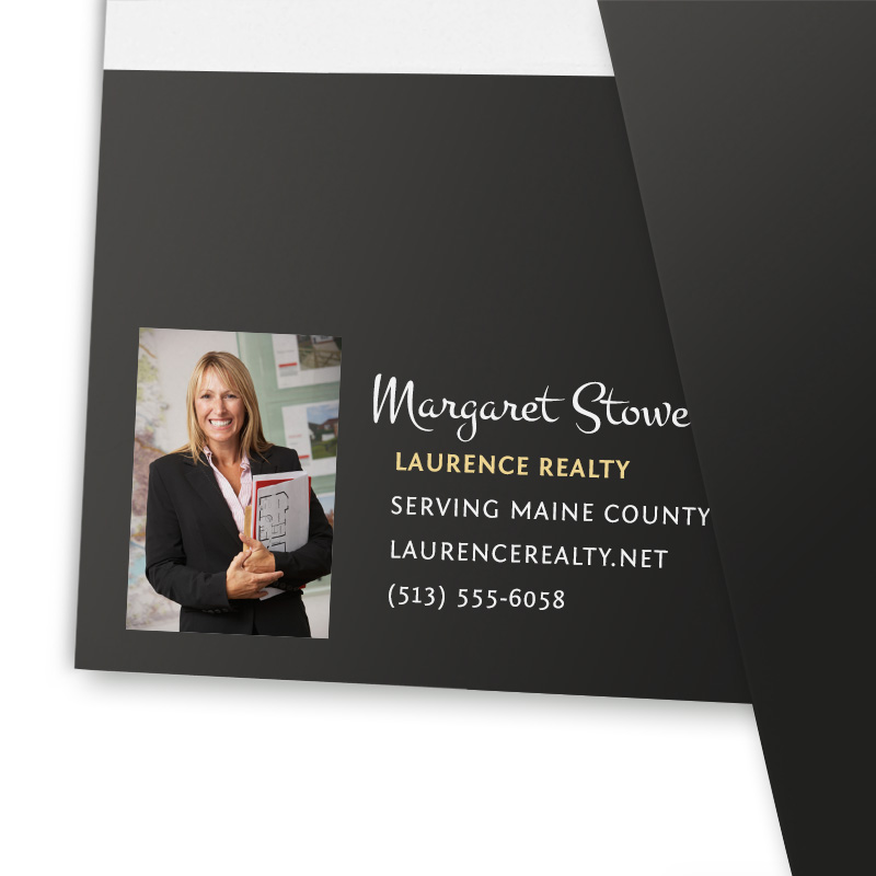
Include a professional headshot
Put your business portrait next to your contact information. Keep it small so as not to overpower your design, but rather to accent it.
Headshot Tip: If you want a 1- or 2-color printed folder, consider printing your headshot in black and white.
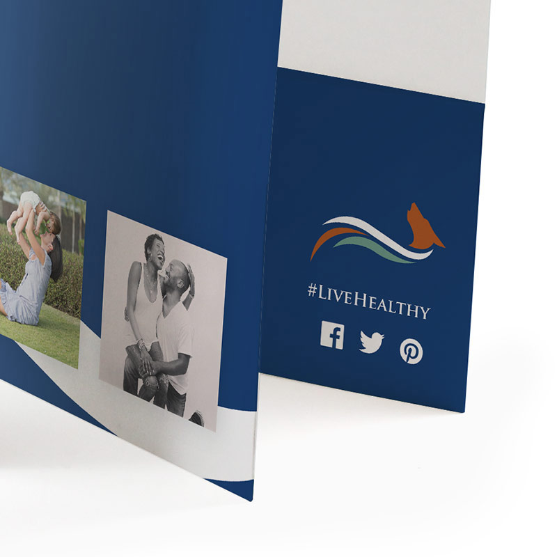
Add social media icons
Are you on Facebook, LinkedIn, TikTok, Instagram, or Twitter? Add the social icons so you can continue the conversation online. If space allows, add your handles.
Social Media Tip: You can use hashtags on pocket folders! Use trending hashtags to expand your reach. If you're hosting a convention, put the convention hashtag on the folder.
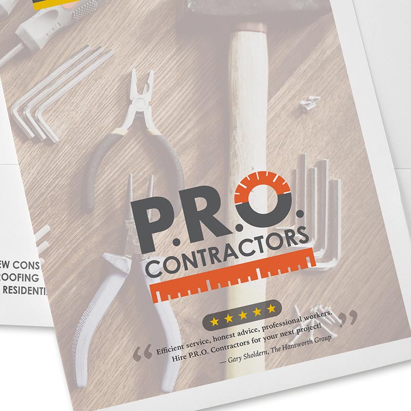
Instill trust with ratings and reviews
A great review can instantly increase your credibility. Include ratings or customer reviews from sites like Better Business Bureau, Angi, or Yelp.
Testimonial Tip: Include a brief testimonial or two on your folder (back cover or pockets are an easy place to add them). Kind words can increase consumer trust.

Utilize the front and back covers
Carry a large graphic or picture from the front of your folder to the back. When using larger graphics, this helps keep your design stay balanced.
Artwork Tip: If you are supplying custom artwork, lay it out on one of our folder templates so that it is printed exactly how you want it.

Low Minimums
Order minimums start at just 150 folders—all with no set-up charges.
Instant Pricing Online
No waiting for a quote. We show you exactly what you'll pay.

Free Email Proofs
See what your folders will look like before production begins.

Free Ground Shipping
Your shipping is on us! Offer applies to orders over $300. Excludes Hawaii and Alaska.
